Community Corner
L&M Hospital Unveils New Logo
Part of the centennial celebration underway this year for the hospital.

A press release from Lawrence & Memorial Hospital:
is planning a variety of ways to celebrate its Centennial year, but none will be more visible than the launch of a new hospital logo.
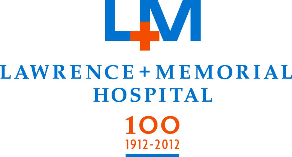
The new logo, which was unveiled to employees yesterday, replaces the hospital’s traditional ‘shield’ logo that incorporated the letters “L” and “M” and waves, representing the hospital’s geographic region.
Find out what's happening in Ledyardfor free with the latest updates from Patch.
Developed by Outthink, the hospital’s creative agency of record from Essex, CT, the new logo was the result of substantial research and planning.
“As we explored a variety of ways to add ‘100th year’ or some other reference to our previous logo, we saw an opportunity to transform the logo in a way that would position the hospital for the next 100 years,” said Crista Durand, vice president of strategic planning.
Find out what's happening in Ledyardfor free with the latest updates from Patch.
Prior to the logo creation, Durand said research focused on both key hospital stakeholders and consumers to gather input on important elements of the hospital, as well as understanding the perception of the organization from those who use it.
From there, Durand said, the hospital team and Outthink worked together to analyze ‘brand DNA’ for the hospital – an exercise that continued to pinpoint key attributes, feelings and insights into the organization.
“The goal, which I believe we accomplished, was to develop a look that mirrors the feelings associated with the hospital,” Durand said. “The Outthink team then set out to create a logo that was simple, strong and approachable.”
Key elements from the old logo do remain in the new look, and that was based on the research.
“The letters ‘L’ and ‘M’ continue to resonate strongly,” said Durand. “People refer to us that way more than Lawrence and Memorial, so we needed to make sure that visual continued to be strong. Additionally, the blue is the same color as the previous logo. So many gravitate toward what that color represents for us – history, location, strength and capabilities.”
The new logo utilizes a ‘+’ sign instead of an ampersand between the letters. The ‘+’ sign now serves double duty, according to Durand. It serves as the ‘and,’ but it also widely recognized as a sign for aid, healing and healthcare.
The hospital will use the logo with the centennial reference of 1912-2012 for this year, dropping it in 2013 and beyond.
The new logo will be transitioned in to all areas of the hospital over time, said Durand.
“This isn’t an overnight transformation,” she said. “As we move forward, we will incorporate it where appropriate. Building signage isn’t changing immediately, and other things will get done over time. The transition will be significant, but we feel strongly this logo will strengthen the L+M brand well into our next 100 years.”
Get more local news delivered straight to your inbox. Sign up for free Patch newsletters and alerts.