Neighbor News
Color Theory Basics Everyone Should Know for Interior Decorating
Used wisely, colors can create the intended atmosphere in each space of your home. That's the interior color design wheel at work.

Ever notice that most bedrooms feature soothing, calming neutral colors? Living rooms tend to be more colorful? That’s the interior color design wheel at work. Most people don’t spend a lot of time thinking about how color affects how they feel, even in their homes or offices. As much as the design of our homes should reflect our personalities, so should the colors. Used wisely, colors can create the intended atmosphere in each space of your homes.
Color Theory Basics for Interior Decorating
Color theory in the context of design refers to how certain colors make us feel. The theory that the colors we use can affect our mood and state of mind goes back as far as Ancient Egypt. For instance, red was thought to increase circulation, blue to soothe pain, and orange to increase energy.
The interior design color wheel we use today displays the primary, secondary, and tertiary hues.
Find out what's happening in West Palm Beachfor free with the latest updates from Patch.
- Primary colors: red, yellow, and blue.
- Secondary colors: mixtures of two primary colors, namely green, orange, and purple.
- Tertiary colors: a mixture of one primary and one secondary color.

Choose Paint Colors That Flow
Although a home is divided into separate areas, each one should flow seamlessly into the others. They don’t have to match, but they should go together. This goes for color as well as style. If the colors and styles are too starkly different, the overall look will be unsettling. Rather, choose colors, patterns, fabrics, and objects that balance each other in a way that feels natural and connected.
If you have an open floor plan like the one above, painting all the walls in the connected spaces is ideal. The Oyster Bay Hidden Lake Bistro Table and Merrick Swivel Counter Stool Set from Lexington gives this space a hip, modern edge to the open feel of this space. If you prefer a bit of variety, choose your wall colors following sightlines from one room the next. These visual connections from room to room have a soothing effect.
Find out what's happening in West Palm Beachfor free with the latest updates from Patch.

Pick a Temperature Palette
A quick way to create an attractive space is to choose a cool or warm palette, using a variety of colors only within this scheme. For instance, if you choose to use cool tones, consider painting your walls a soft, light blue and use gray or white on the trim. For a warm palette, pair a diffused, peach wall with an eggshell or ivory trim.
Neutrals can mix and match with cool or warm accents. The cool blue of the Bedford Customizable 3-Cushion Sofa from the Lexington Personal Design Series demonstrates how neutrals like beige or taupe have a yellow, pink, or blue undertone. This pairs well with textured walls and dark wood finish. However, with this completely customizable sofa, you choose a contrasting color such as red to create drama.
But keep in mind that neutrals like beige or taupe have yellow, pink, or blue undertones, so choosing a neutral with an undertone that contrasts or matches other elements will make a difference in the design. Also, warm colors can make a room feel closer, and cool tones can make it seem bigger.
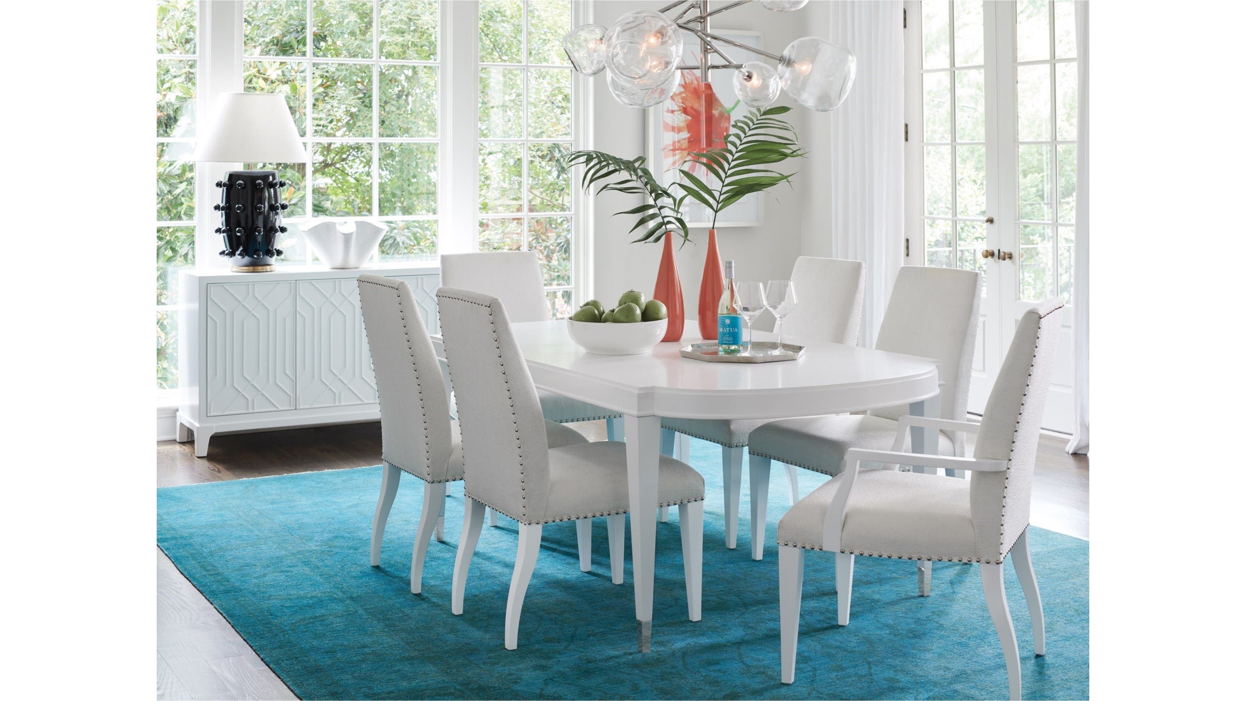
Balance Your Palette
Pick one color to use as the dominant in about 60% of your décor. Most people choose a neutral to play this role. Your secondary color should be used at about 30% and your accent color at about 10%.
In this dining room above, the soft white paint on the walls and the finish and upholstery on the Avondale 7 Piece Dining Set with Vernon Hills Oval Table with Leaves from Lexington take up most of the room’s surface area. Jewel-toned blue, the secondary color, takes up about 30% of the space, and the bright orange accent color takes up 10%.
Add the Finishing Touches
Fabrics and textures are an integral part of a room’s décor. Window treatments, wooden or stone surfaces, furniture upholstery, throw blankets, and pillows will add texture to make the room feel comfortable. You can dress your room up or dress it down to create a formal or informal vibe. A room can be dressed up or down to give it a formal or informal feel, depending on whether you want a chic or lived-in look. The choice is yours.
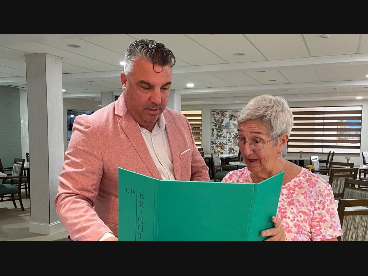
Get more design inspiration and read Baer's Furniture reviews. Learn more about Baer's Furniture.