Neighbor News
The 101 Behind the Psychology of Color for Signage
How colors you choose for your business impact the way people feel and think about your brand.

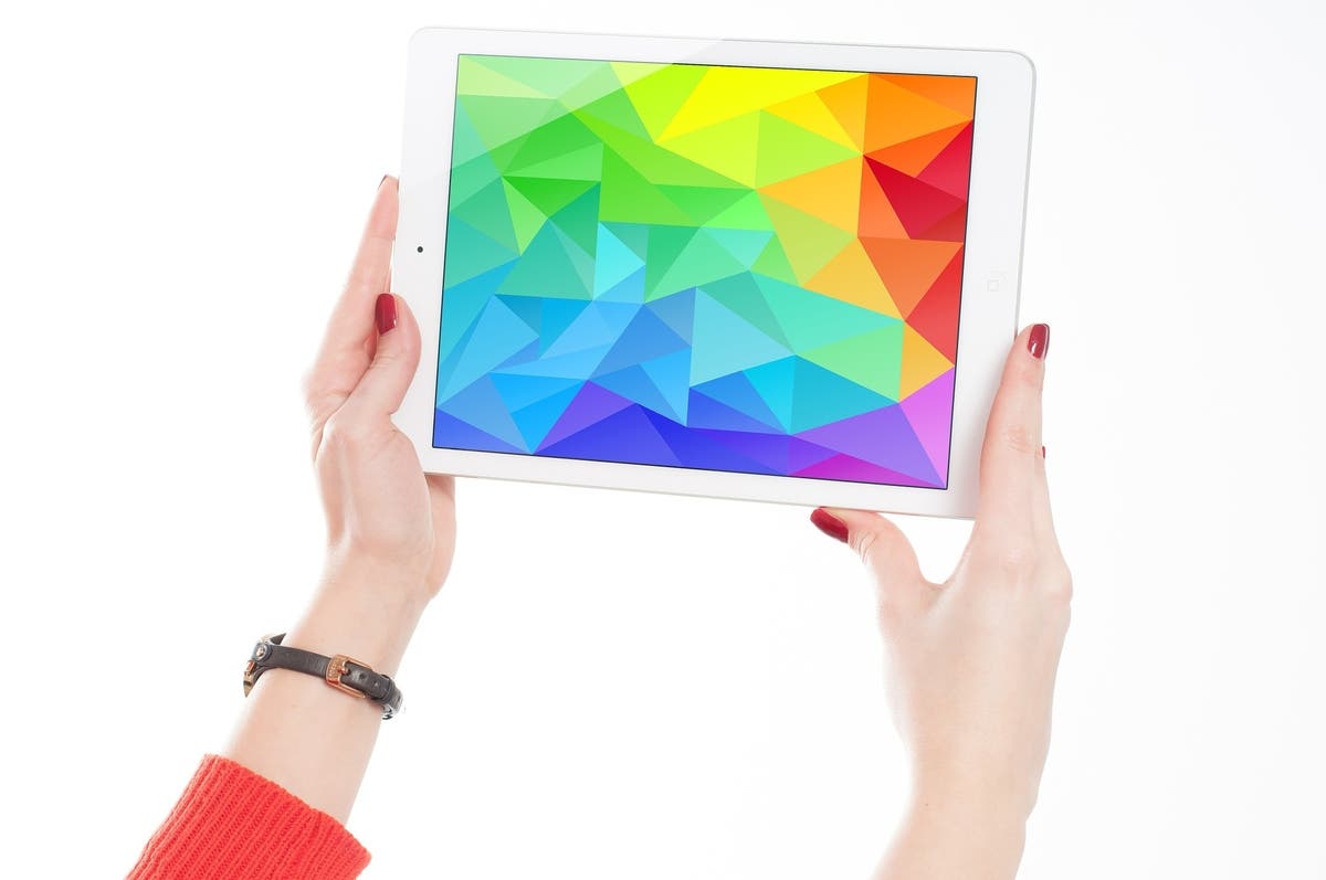
Colors carry emotional resonance. They have the power to make us feel happy, sad, passionate or angry. They can remind us of a specific food, have us yearning to revisit our favorite vacation spot and prompt us to drink more water. Colors carry influence. Why? Because they’re a natural stimulant.
Have you ever flicked through a rack of clothing at a department store, picked out a bright coral shirt even though you hate the color and smiled all because it reminded you of a starfish you played with on vacation two years ago? That’s the power of color.
It only goes to reason that the colors you choose for your business represent what you want your potential customers to feel and think about you. For instance, you’re not going to choose a solid dark red sign as the color scheme for your much awaited children’s store. Red signifies passion, anger and love. For a children’s store you’re going to want to use bright and vibrant colors like pink, yellow and orange because they signify youth, happiness and fun.
Find out what's happening in Buffalo Grovefor free with the latest updates from Patch.
So, here are the basics of color psychology according to good, old, reliable ROY G BIV:
Red: Ellicits anger, passion, aggression, love. Businesses that use these signs tend to promote or provide more personal products or athletic services; think, Victoria’s Secret, martial arts or fitness gyms.
Find out what's happening in Buffalo Grovefor free with the latest updates from Patch.
Orange: This is a youthful or energetic color. Unlike blue or green, orange inspires the need to move and get active. For example, Orange Theory Fitness.
Yellow: Another youthful color similar to orange, it stimulates feelings of happiness and fun. Businesses that have used this color include McDonalds and Toys-R-Us.
Green: Green is the symbol of birth, newness and serenity. Recycling companies are renowned for using this as their stable color because it represent renewal and rebirth.
Blue: Peace, cleanliness, patience and quiet are associated with this color. For instance, water companies use this as a sort of Pavlovian experience. When you see the color blue, you immediately think of water.
Indigo: This color is a variation of both blue and purple and can be used to elicit similar or separate emotional responses. As an unusual color, it tends to prompt a more curious response and attraction.
Violet: Purple, or violet, has always been a royal color – one used sparingly. Because it is such a vibrant color naturally, only very unique businesses utilize it unless paired with other colors. For instance, carnivals or tarot card readers may use it as a primary color.
Essentially, cater the color of your business’ signage to the kind of business you wish to promote. If you’re a ladies lingerie store, don’t use yellow or orange as a color back drop. The disconnect between product and advertising can be your biggest downfall.