Community Corner
Style Central: How to Bend a Trend
Figuring out what new fashion trends are worth our time and attention can be tough going these days. Here's a rather tricky trend that you can make work, but only if are willing to give it a try!


If you've seen any fashion magazines or store catalogs lately, you have likely noticed the proliferation of wild and crazy color/print combos out there this spring. And I must admit, it's quite refreshing after such a long steady diet of winter black and grey!
But the craziest combos of all are not red, green, blue and orange all together now. Rather, it's the mixing of various prints and patterns along with the red green blue and orange. Even stores with traditionally more conservative fashion layouts like Talbots and J.Crew are showing the most outrageous combinations of colorful florals, stripes and animal prints I've ever seen!
For young women who are having fun with fashion and still experimenting with their own sense of personal style, this a fantastic way to do it. But for those of us who are more. . . shall we say mature? This print and color mixing thing can be daunting to say the least!
Find out what's happening in La Grangefor free with the latest updates from Patch.
So, here's a suggestion for dipping your toes in the waters of trendy this season.
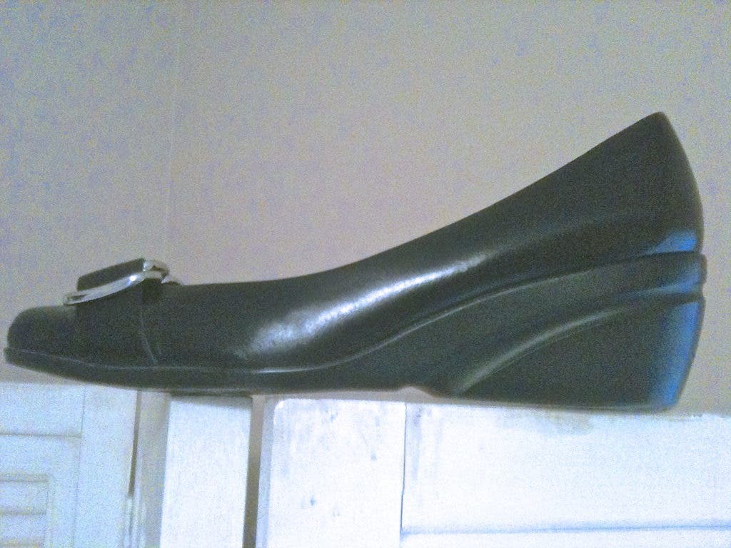
First and foremost, we need to understand that the colors we choose to combine are absolutely key. We want to make sure that we stick to a neutral color palette when combining prints such that each print has the same neutral basics. For example, I have a great little polka dot sweater that I bought a few years ago and that I wear every spring. It's navy blue and white and it's a durable cashmere classic. Ordinarily, I would wear it with a white shirt or cami and a pair of navy pants. Very classic, very safe. This year? I am pairing the sweater with a navy and white horizontal stripe t-shirt and a lighter blue and white stripe scarf. For a more casual vibe, I'm wearing dark wash wide-leg jeans instead of dress pants, and some black wedge heels.
Find out what's happening in La Grangefor free with the latest updates from Patch.
I'm also accessorizing with green jewelry and a green belt. It works because I'm staying within the boundaries of the neutral color zone. No bright red or orange for me, thanks. Just a touch of green to keep it interesting. But one can't get more neutral than navy and white, right? (By the way, blue and green are the IN colors of the season, just so you know . . . )
When and if the weather ever gets warmer, I have a lemon yellow sleeveless blouse I'll wear with the polka dot sweater; I'll add a floral scarf (see photo) and switch to white slim-fit cotton pants. I'll also trade in the black wedge heels for pair of tan linen flats. And I'll keep the green belt and jewelry as accents.
This note to my more mature friends, especially baby boomers. I must caution you about floral prints. They are wonderful in small doses . . . like a tank top, a chiffon scarf, shoes or even a cute handbag. But dressing entirely in flowers is a sure-fire way to launch oneself into the matron zone. A place I'd rather not visit. Not now. Not ever.
So, the next time you see a pretty Vera Bradley print that speaks to you, please think twice. Noted designer Miuccia Prada also has some beautiful floral prints she's showing this season. Thanks but no thanks.
My dear readers, will you be brave enough to step out of your comfort zone? What the heck, why not?
It's spring at last, spring at last. Thank God, it's spring at last!