Health & Fitness
ChooseMyPlate.gov Replaces MyPyramid.gov
June 2nd, the government replaced the "My Pyramid" icon with a "Choose My Plate" icon


Today, the USDA released the new icon to be used to frame discussions about dietary guidelines. I thought this would be a good point to start my blog about healthy eating.
The new icon is intentionally simple. It is a place mat with a plate, illustrating rough proportions of five food groups:
- Fruits
- Vegetables
- Protein
- Grains
- Dairy
The new website for the new government gateway to healthy eating advice is http://www.choosemyplate.gov.
A couple of things to note about the name. "My" is purposefully emphasized, as it was in the previous "MyPyramid.gov" to illustrate the importance of personalizing the messages to make sure they apply to each individual's unique needs. "Choose" is purposefully emphasized because they want to talk mainly about what to choose as opposed to what to avoid.
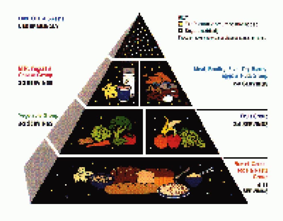
Personally, I will miss the "what to avoid" aspects of the food icon. For example, the 1992 Food Pyramid had, at the top, a small triangle with "added sugars and added fat." The smallness of the triangle was meant to stimulate discussion about limiting added fats and sugars. The concept was continued, though obfuscated, in the 2005 version of the MyPyramid icon by the narrowing bands of the image.
Oil and exercise are no longer part of the icon although they are part of the guidelines the icon represents. The steps going up the side of the pyramid meant to stimulate discussion about making gradual dietary improvements are gone. Although a major message of the dietary guidelines is "do not eat too much," there is nothing on the icon which stimulates that point.
Simplicity is the strength of the new plate based icon. It illustrates only a very few messages. Over time, there will be derivative works which expand on the icon. But simplicity is also its weakness. What I hope to do with this blog is help provide more depth of nutrition information.