In both the private and public sector, brands and logos don't matter much except to the creative people who develop them.
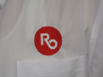
I'm reacting to Royal Oak's new brand/logo, of course, but my experience both as a former private sector executive and as a management/marketing consultant has many times confirmed that conclusion. Manufacturers agonize to create a symbol which will make their boxed product jump out from a wholesaler's shelf. Net effect? Not determinable. Creative people develop a "meaningful" configuration of graphics and letters. Net effect? Can't say. Does blue generate more traffic than red? Are sans serif fonts easier to read? Makes no measurable difference.
Bringing the discussion back to Royal Oak: How long after that yellow DDA monstrosity which looks like a real estate for-sale sign was introduced did you stop seeing it? Except for the old torn and floppy ones, of course.
Find out what's happening in Royal Oakfor free with the latest updates from Patch.
Worst scenario ever:
I was a member of a professional association when a committee of company executives spent six hours deciding what color a ribbon should be for newly created award. The discussion included much psychobabble. Does anyone believe that the awardees and their loved ones would appreciate the honor less because of its color?
We read that the Royal Oak logo cost $20,000. It shouldn't have cost more than $7,000.