Health & Fitness
Betty McCollum and the NYT's Tricky Chart "Policy Changes Under Two Presidents"
Betty McCollum held a town hall meeting on Aug. 9 where she presented a New York Times chart. Let's analyze the chart and see how well it holds up.


Defending the Bush administrations penchant for spending is difficult for a conservative, however the injustice of this particular canard is worth the attempt. This chart (shown below, originally from the inventive minds at the New York Times) was what Rep. Betty McCollum kept referring to in her talk at the Aug. 9, 2011, townhall meeting in St. Paul. It is an interesting and admittedly ingenious attempt to continue the "blame Bush" syndrome that has grown up amidst the liberal/progressive activists and intelligentsia. It represents a particularly pointless and strange phenomena that has never been used so prominently, nor for so long, by an administration and their adherents before. I don't remember George W. Bush using the Clinton era Internet bubble recession, or even the 9/11 attack, as such a consistent scapegoat for the very real and significant problems that he faced when he came to office. I don't believe (though I am sure there are those who will attempt to disabuse me of that belief) that Reagan admonished the first Carter administration continuously and frequently for the disaster that he inherited, and which we are now repeating.
First let's see exactly what McCollum said at the town hall meeting, and the chart she used from the New York Times, then, let's dissect the chart point-by-point, and show why I believe it is such an egregious canard.
http://www.youtube.com/watch?v=aBQkQmx4rPc
The chart discussed (see above)
http://www.nytimes.com/imagepages/2011/07/24/opinion/sunday/24editorial_graph2.html?ref=sunday
http://mccollum.house.gov/images/stories/Statements2010/slide%207.jpg
Betty McCollum and the progressive strategists at NYT, and elsewhere, may believe this is "damning evidence" but I'm not so sure its a very good representation of "truth." So let's dissect this chart point-by-point. Policies that are in place and actively spending money should show up in that year's Congressional Budget Office spending. So let's see when each policy began, and what the real dollar deficits look like.
"Bush Tax Cuts" were implemented in 2001, and Obama has fortunately chosen to continue them. During the Bush presidency this accounted for $1.5 trillion, to which Obama has added $1.3 trillion in his two years and nine months in office. These tax cuts are part of the reason why so many people earning below $50,000 pay NO federal income taxes. How much more progressive can you get? Oh, yeah, and the earned income credits, etc., redistribution system giving unearned money to lower income people. The end result that according to the AP, 40 percent of people "make a profit from the federal income tax." So why don't they love it? Beyond all that, the act of letting people keep their own money and calling it a "new cost" is an example of using deceptive propaganda techniques.
National defense is actually one of the few constitutional federal provisions. The Afghanistan war began in October of 2001, and the Iraq War began March 20, 2003. So the wars that began as a result of an attack on our soil (let's not get into an argument over the "necessity" of the Iraq War, it's not germane to this discussion) were part of the spending during the Bush years. The significant portion of the costs of the Iraq war essentially occurred during the presidency of Bush, who began limited troop reductions in 2008, and left the completion for the next president. President Obama has further reduced Iraq spending, but increased Afghanistan, in addition to starting up a third new conflict in Libya which will reach an additional $1.1 billion by the end of September.
The TARP program, like it or hate it, (I was personally in the doubtful but hopeful camp on this) was originally envisioned as a short-term fix that would be repaid to the taxpayers as the banks recovered. In fact it apparently achieved that part of the goal and even made some money, but has since been essentially used as a special Obama "slush fund," see here, and here for political gain. So the net cost to the taxpayers should have been ZERO, unlike what the chart shows, but the continued use by the Obama administration and others has made it a continued liability.
The 2008 Stimulus was called for by President Elect Obama, but is entirely attributed to Bush in this disingenuous chart. At a minimum it should be a shared policy, but Obama went further in demanding it, or he'd do it!
Find out what's happening in Oakdalefor free with the latest updates from Patch.
"NYTimes Nov. 7, 2008: Mr. Obama called on Congress and the Bush administration to pass an economic stimulus package. If an agreement cannot be reached this month in the lame-duck Congressional session, he said, it will be his chief goal when he takes office on Jan. 20."
So we, Rep. McCollum and the activists at the NYTimes, need to accept the fact, Obama really owns this one, as well as the "son of stimulus" that is already in the chart on his rather diminished side.
The Medicare Drug plan was enacted Dec. 8, 2003. First, if it hadn't been enacted by George W. Bush, it most certainly would have been part of the Obamacare plan, so one shouldn't be too quick to place it ideologically under Bush alone. Second, as a conservative, I could never quite understand the progressive's reaction to this plan. I understand why I and other conservatives thought it was undesirable, but this would seem to be ideologically right in line with progressive thinking. Regardless of its merits, the costs of the program were baked into George W.'s budgets from that point on, and should be evident in any chart showing real spending.
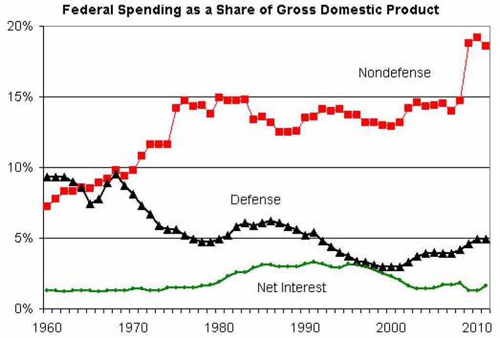
The rather ill defined "non-discretionary" spending is simply too vague to analyze at this point. I will have to let the chart below speak to it. The 2008, 2009 and 2010 sudden rise in the nondefense curve show the dramatic rise spending, due to the TARP, stimulus, and son of stimulus that Barack Obama is now using as his baseline spending. Each of his budgets, proposed but never passed, has reflected this continued, or rather is exceeding this, level of spending. [Note Congress, in particular the Democrats and the Budget Committee which Rep. Betty McCollum is on, refused to pass a budget, until the Republicans took the House this year and passed a budget that was killed by the Democrat Senate]
http://www.cato-at-liberty.org/five-decades-of-federal-spending/
[see above]
So the results of this analysis show that almost any policy that has been attributed to George W. Bush should be well reflected in a chart of spending during his presidency 2001-2008. One can argue that 2009 reflected a Bush budget (especially since we haven't had one since), but I believe the analysis above has shown that Barack Obama inescapably shared and "demanded" the TARP and stimulus programs, and thus completely owns the 2009 spending as well. So what is the actual chart of spending deficits and Obama proposed budget projections? It shows that Bush spent way too much, no surprise there, but Barack Obama has made that spending look like small change!
http://blog.heritage.org/2011/07/28/the-truth-about-obamas-budget-deficits-in-pictures/
[see above]
Thus I am not sure that Rep. Betty McCollum's speech really shows the correct analysis of our national debt and deficit crisis and thus would probably never address the real problems. Remember that!