Health & Fitness
What Lies Behind a Logo?
Creative Agency M studio discusses the power of Brand Identity.


To quote Simon Manchipp of London based SomeOne …”the logo is dead.” A bold statement indeed, but it raises some discussion. A successful brand identity depends on if you remove a logo and still know the brand. These days a successful brand identity can be implemented over time in non-traditional methods. Through the use of “cohesive” identity application branding can stretch across many platforms; standing out in a crowd of logos, thus reaching a wider audience. The logo is not the hero anymore; the environment, language and everything in between is what makes a brand. This way of thinking is what Simon Manchipp and SomeOne call Brand Worlds. Coherent ways of applying design to a brand are what we remember, not the repetitive use of a logo. That goes for printed materials, environment and even messaging. Just think of Adidas, the continuing three stripes represented on their clothing and shoes, or Progressive Insurance, first thing that comes to mind is probably their strange mascot “Flo” from the commercials, not their logo. We need to apply more emphasis on these so-called Brand Worlds.
Here at M studio, we understand where Manchipp is coming from with his so called Brand Worlds. Although the use of a logo is imperative to a brand in order to distinguish them from others, the cohesive use of everything besides the logo is what needs and gets the most attention. This goes for colors, typography, photos, illustration and the way language is utilized within the brand. Our job as designers is to make a brand identifiable, with a logo or without. A successful brand means having people recognize some facet of the brand in an instant, thus creating brand loyalty.
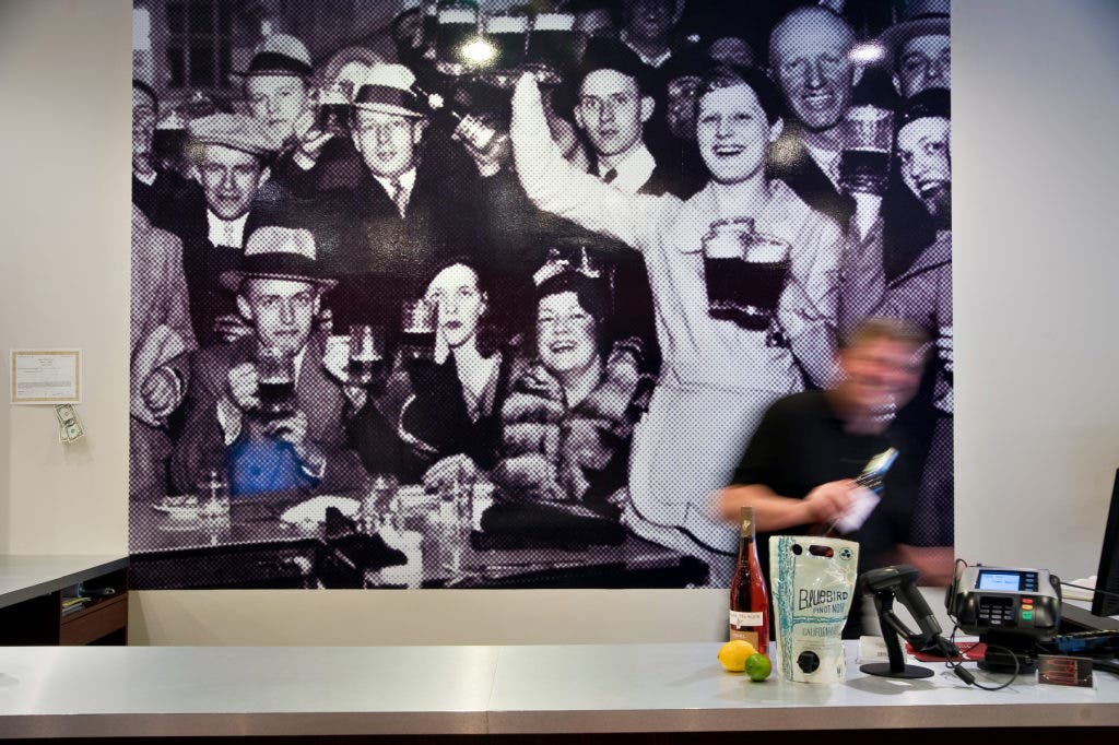
As part of our practice at M studio, we knowingly exercised the notion of creating Brand Worlds. A downtown Asbury Park liquor store Lush, needed a brand identity. The environment and feel of the store came next after creating the appropriate mark that translated great to a neon sign. No, the Lush logo is not pasted upon each wall and aisle. Instead, a system of patterns were applied to environmental graphics that navigate the customers to easily peruse the store for reds, whites or beers were installed. The use of prohibition era imagery, added brand colors and fonts set the stage for the identity and the fun spirited approach the brand represents. This use of signage and intriguing imagery created an organized flow of the space and crafted a unique experience for their clientele. Lush’s patrons then walk away with an experience unlike any other liquor store.
Find out what's happening in Red Bank-Shrewsburyfor free with the latest updates from Patch.
Check out some of our Brand Identities at www.mdidit.com