Community Corner
Vintage Typography
Melissa shows us Bellmore through her camera's lens and historical viewpoint.


Being a designer myself, I understand the importance of art history - especially vintage typography. I took a drive around Bellmore to see if I could find some antique signs that would bring me back to the good old days. I found a couple of businesses showcasing the classic feel I was seeking. I must say with all the new technology it is almost rare to find signs or even old buildings presenting such a feeling of the past. I may be part of a generation where digital art is 90 percent of my work, but I am in awe of vintage design. Sometimes I think I should have lived in the 1950s! From fashion to advertising, it is one of my favorite eras. I am jealous of the people who experienced those years because they were such an inspiring time for graphic design.
My first stop was Abco Art on Sunrise Highway. I have passed this store before and was always drawn in by its look. The sign on the right side of the building may be simple, but its vintage appeal and straightforward design screams collector's item. Surprisingly, it's in good shape considering the weather conditions it has been subjected to. The blue, red and black colors are classic and the bold sans-serif typeface was very popular back in the day. Helvetica, for example, is one of the mostly used fonts for advertising and logos. It was developed in 1957 by Swiss designer Max Miedinger with the help of Eduard Hoffman and it was intended for signage. The Abco sign shows the famous characteristics of Helvetica and seems to have used two versions of the font; black and bold. If you are interested in learning more about this typeface I highly recommend you check out a film by Gary Hustwit called "Helvetica."
Another business I found on Sunrise Highway was the Furniture Doctor. The sign is a little more decorative, but showing the same characteristics as the Abco sign with its colors and bold typeface. The store has been around since 1966 and I appreciate its loyalty to antique design. By keeping with the original feel of its time, the Furniture Doctor not only shows experience in its offered services, but also the history of the business.
Find out what's happening in Bellmorefor free with the latest updates from Patch.
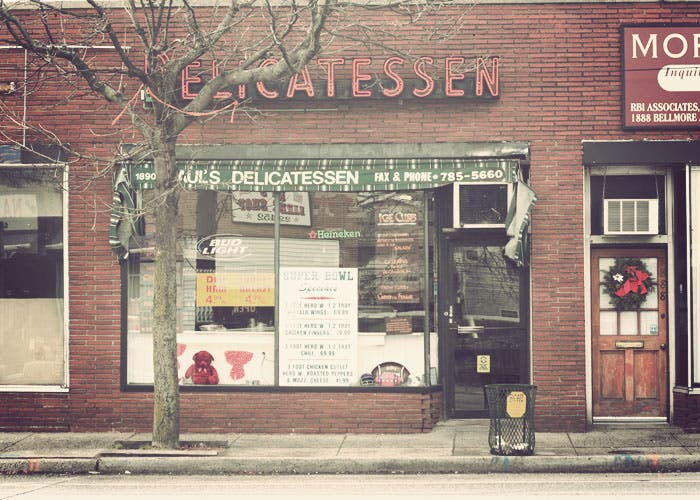
I then ventured out to Bellmore Avenue where I found two places that caught my eye. Both expressed that vintage appeal I was looking for and inspired me to do some research. Paul's Deli has that famous neon "delicatessen" sign hung above its window. With the green classic awning, it takes you back in time. Since the 1920s the neon sign has been highly popular. Georges Claude introduced the idea to the United States in 1923 and sold the first two signs to a Packard card dealership. Since then they have been used to represent all different kinds of businesses. We might be more familiar with restaurants and eateries like Paul's Deli. It's classic sign brings a lot of history to Bellmore Avenue.
Right across the street on the corner stands Ray's Barber Shop, barber pole and all. This famous pole dates back to the 1100s and originally was associated with bloodletting, the withdrawal of large quantities of blood. This service was offered by barbers along with surgery and tooth extractions. The pole represents the process of the bloodletting procedure and its red and white stripes symbolize the bandages that were used. Red for the bloodstained bandage and white for the clean ones. The spiral pattern of the stripes, especially in their movement, artistically express the bandages blowing in the wind when hung to dry after washing. The blue was added to poles in the United States and is said to pay homage to the American colors. I found this interpretation very interesting, considering I would never think of a barber doing anything else but cutting hair. Before 1950 there were only four manufacturers of the barber pole, but soon after there were thousands being made.
Find out what's happening in Bellmorefor free with the latest updates from Patch.
The "barber" sign on the left side of the building is also a great find. Simple and antique, this red, white and blue sign shows some nice craftsmanship. Unlike the others its letters are nailed on and only have slightly aged. The use of the serif typeface allows the letters to flow more easily as you read from top to bottom. This sign could easily be missed if you aren't walking toward the shop. But when it does catch your eye, you can appreciate what history has taught us.
It's places like these that keep our memories alive. Getting your haircut where you grandfather used to is a really cool thing to experience. Having your furniture restored or a priceless piece of art framed by a company that has been around for a while gives you a sense of comfort. Sit and enjoy a sandwich and watch the world pass by. Vintage design will always remain present if you maintain its beauty for the future.
(Editor's Note: A New View is a bi-monthly column that will be featured on Bellmore Patch. We welcome Melissa O'Connor's superb photography skills and informative history lessons.)