


The chart "bubble" is the academic representation of an asset bubble. The key take-aways here are three-fold:
1) The shape is very recognizable
2) The peak is followed by a “return to normal” fooling people into staying
Find out what's happening in Hudsonfor free with the latest updates from Patch.
3) Capitulation is the total loss of faith in the storyline that created the bubble
Find out what's happening in Hudsonfor free with the latest updates from Patch.
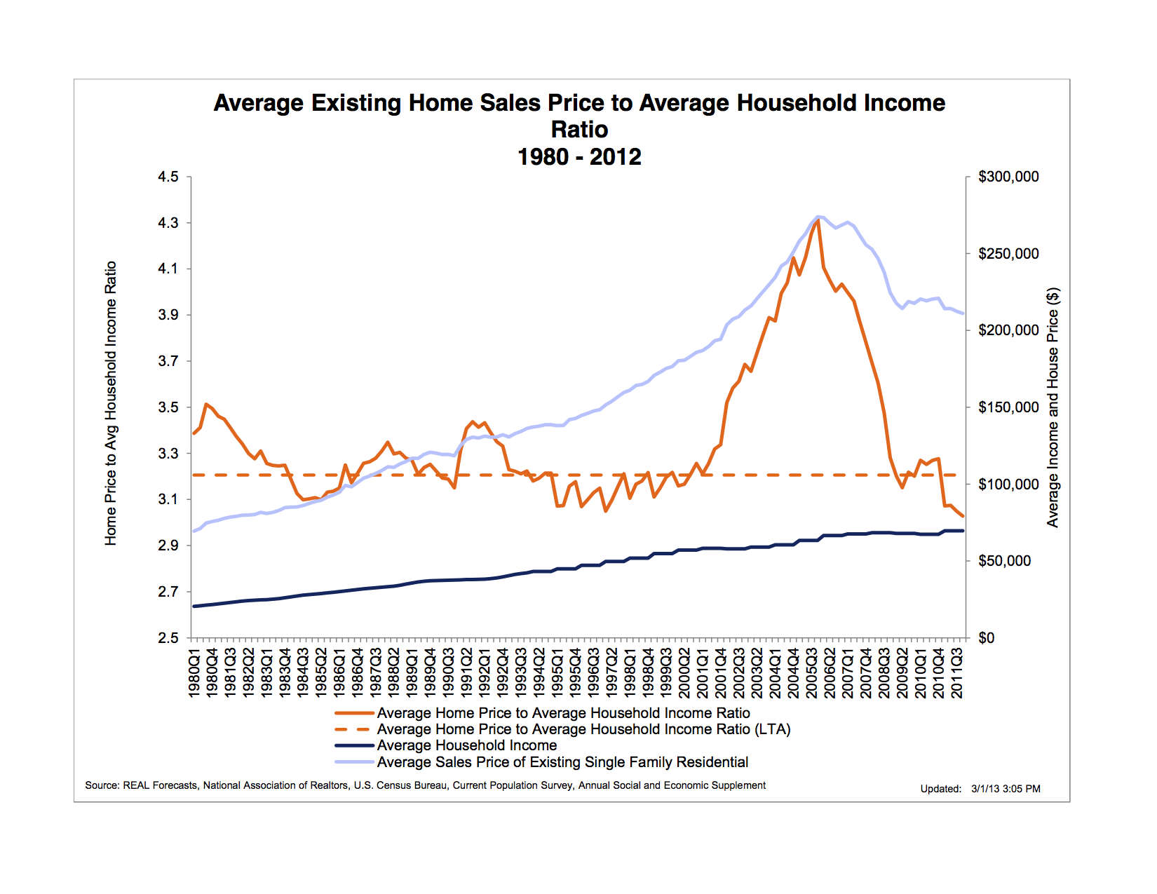
Let’s look at the housing bubble "income/average home price" chart-
A home purchase is about more than the utility and affordability of where we park our body each night until we “assume room temperature” as Limbaugh coined. There is a long history of correlation between an American’s income and how much home he/she can afford to pay for each month. Americans don’t look at a home as a $160K mortgage, they see it as a monthly payment of $839.
The orange line represents average loan amount to income, which stood at around 3.2 (ex- 3.2X50K income=$160K average home) and inflated to 4.2 x’s income before retracing. This was an effect of low “Adjustable Rate Mortgage” (ARM) loans and easy lending which combined to create massive speculation. After the housing bubble popped the income to home price normalized.
The Blue line represents the problem. While buyers (orange) have capitulated on sensible loan to income amounts, the sellers have yet to capitulate. Why?
To stop home prices from capitulating the Fed dropped interest rates to zero (Fed Rate - 0), which is the equivalent of a junky’s dealer doubling heroin as the solution, also. Home sellers were supported by buyers that had new “cheap” money provided by the Fed. The buyer’s payment bought, well, “more.”
The bubble’s price capitulation phase is still dead ahead. Here is how it happens and why.
Interest rates are rising despite the desire of the Federal Reserve (Story). This is not the forum to discuss The Fed in depth, but there are 3 key facts you should know:
1) Our stock market and economy are addicted to heroin low interest rates
2) As an addict it has a dealer, called The Fed
3) We are about to experience the equivalent of monetary withdraw
In time this will force sellers to lower their prices for the simple reason that a monthly payment will rise with interest rates (WF Mortgage Rates). The “amount” of home people can afford has now dropped and everyone must adjust their home prices in order to keep the same number of “buyers” in your price-range. As this chart shows, Wells Fargo mortgage rates changed the “affordable home price” directly as it affects the “amount” of mortgage you can afford each month.
Bill Rubin’s blog says the St Croix has 4.3% unemployment. I’ll take the over on the trend-line.
I’m setting the over/under on 2015 interest rates at 18% (which is only 1980′s levels). What do you think that does to your home’s value?
The real question is, “why is no one on the blue or red team stopping this from happening or screaming about the risk?” Sadly, it is either ignorance or complacency. Not sure which one.