Health & Fitness
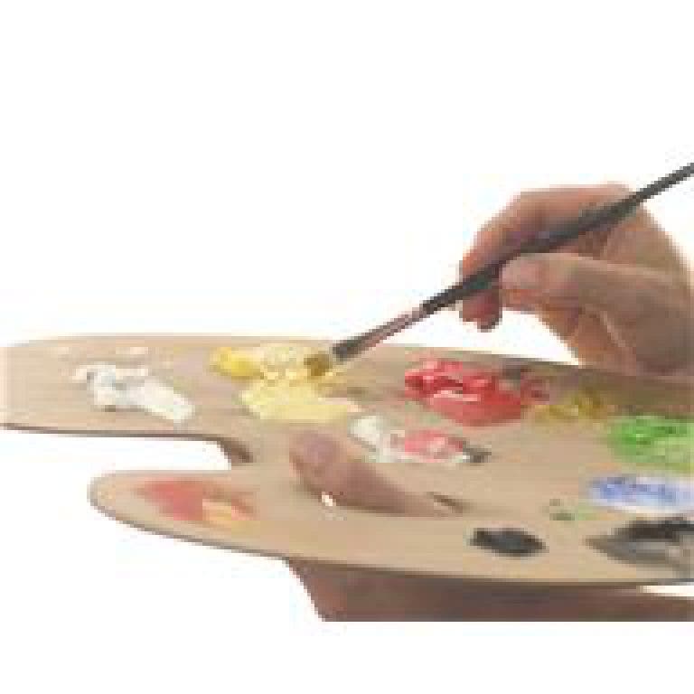
The Palette - Do You Have a Favorite Color?
We all have a favorite color, or set of colors we are attracted to. As artists, do we have a natural tendency to lean towards those colors in our work?
"Colour is my day-long obsession, joy and torment." -- Claude Monet
I went to my son's Pop Warner game the other night but instead of watching the field I watched the sky. It wasn't one of those summer night skies that are on fire with reds and purples but it was subtle light pinks and lavender with some dark bluish purple clouds cutting across in quick, ever changing patterns. Thankfully, it was only a scrimmage game that I missed.
The night sky got me thinking about colors and what attracts us to certain hues. Some artists are known for a certain palette. Take Vincent Van Gogh for instance - he had a thing for yellow or, as he fondly called it, "high yellow". Some scholars believe his high yellow palette stemmed perhaps from side effects of foxglove plant poisoning or digoxin toxicity. Foxglove was used to treat epilepsy, but they do not know for sure that Van Gogh used it. Just before his death in 1890, Van Gogh had just completed two years worth of masterpieces in Arles where there was "a sun flooding everything with a light of pure gold". Maybe he just liked yellow!
Find out what's happening in Burlingtonfor free with the latest updates from Patch.
Another great artist that I think of with a specific palette is Claude Monet Claude Monet. Although Monet was by no means limited to these colors, I tend to think of a lot of soft green and lilac because of his Water Lilies series. Monet did use a limited palette of under a dozen colors, eventually banishing browns and finally black by the mid 1880's. Commenting on his color palette in 1905, Monet said: "The point is to know how to use the colors, the choice of which is, when all's said and done, a matter of habit. Anyway, I use flake white, cadmium yellow, vermilion, deep madder, cobalt blue, emerald green, and that's all."
I spend a lot of time perusing other artist's work and do notice that some artists keep to a palette. Others, including me, paint what we like regardless of the color palette and use a wide array paints. There's no right or wrong, however, some galleries do like to see similarities throughout your body of work. Similar subjects, similar color palette throughout the series of paintings, etc. A pronounced style. Take another look at your work and you may find that you are already using a limited palette or have a predominant color throughout your work.
Find out what's happening in Burlingtonfor free with the latest updates from Patch.
Challenge: Using a condensed palette , create several pieces that tie together. See how difficult or perhaps freeing it may be to limit your palette and if your work becomes cohesive. Do you feel it simplifies the painting in a good way? Do you lean towards colors that are favorites of yours? Are you able to still get a desirable range of colors and shades to accomplish what you are after? Or, if you want to really challenge yourself - follow Monet's palette of flake white, cadmium yellow, vermilion, deep madder (alizarin), cobalt blue and emerald green. Have fun!