Business & Tech
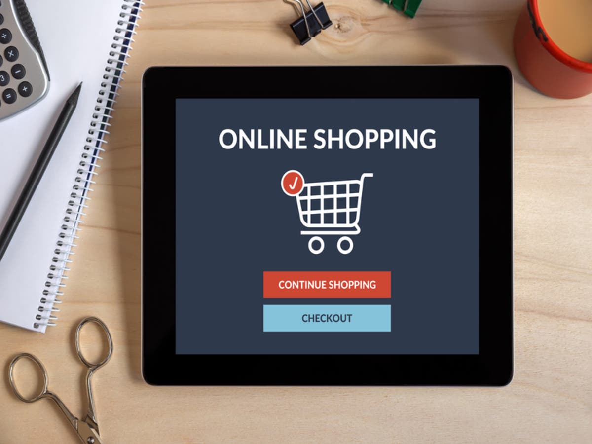
15 Tips To Create A Customer-Friendly Checkout Page
Is your checkout page causing you to lose sales? These 15 actionable tips guarantee a more customer-friendly checkout page.
Sixty-nine percent—that’s the average documented online shopping cart abandonment rate these days, according to one recent study. (Interestingly, it’s also the percentage of millennials who take photos of food before eating it—wow, really?) Another fun stat: Cart abandonment runs rampant on Tuesdays, in particular, and happens least on Saturday evenings.
Reasons for abandonment vary, but the study referred to above shows that much of it can be blamed on a merchant’s online payment system, including things like a too-long, complicated checkout process, insufficient payment methods, and even declined credit cards. I’m pretty sure a large percentage of you eCommerce merchants out there would take advantage of ways to prevent those losses from happening if you could. So if you’re ready to rethink your checkout page and regain some lost sales, you’re in the right place.
Below are 15 things you can do to combat shopping cart abandonment for your online business. It isn’t as hard as you might think to create a checkout experience customers are guaranteed to love—and, most importantly, complete.
Find out what's happening in Marlboroughfor free with the latest updates from Patch.
15 Actionable Tips To Promote Checkout Completion (And Delight Customers)
1. Imagine what the ideal checkout experience should be like. Put yourself in the shopper’s shoes and picture buying something online. Do you want to fill out long forms? Do you want to navigate through multiple steps or check out with one simple click? My advice: Don’t listen all that “conversion” mumbo-jumbo. Customer conversions are important, but your focus should be on designing a human-centered checkout experience. If you do it right, conversions will increase naturally.
Find out what's happening in Marlboroughfor free with the latest updates from Patch.
2. Focus on site stability and performance. Your checkout page should work. That sounds basic, but it’s important to remember! If your checkout page is consistently down or slow to load, you’ll have a hard time keeping customers.
3. Prioritize and emphasize security. According to the previously mentioned study, eighteen percent of abandoners leave you high and dry during the checkout process because they don’t trust you to keep their credit card information safe. Make sure your payment process is secure, then communicate your security measures to your customers.
4. Offer guest checkout. Not everyone wants to “sign up” with your company just to make a simple purchase. (In fact, a whopping 35% of cart abandonment happens in an effort to avoid creating an account!) Rather than risk losing a sale, offer a guest checkout option.
5. Offer Apple Pay/Android Pay. These one-click payment types are the wave of the future, thanks to their incredible ease of use and supermax-level security features. (You might think I’m overstating the awesomeness of these payment methods but they have actually been referred to as “fun”— and if you can give your customers a fun checkout experience, more power to you!)
6. Offer a wide range of additional payment methods. As much as I like Apple Pay, there’s a whole world of payment methods out there—particularly if you’re selling to the whole world. Besides credit cards and Apple Pay/Android Pay, there’s ACH, PayPal, Sofort, Giropay, Alipay, etc. Your customers want to pay with whatever method they’re most familiar with.
7. Offer a localized checkout experience. You’re missing out on international sales if you’re not giving shoppers a “local” checkout experience—one that shows the checkout page in their own language and prices in their local currency. Localization promotes a comfortable shopping experience that feels local, even if it’s not. Now isn’t that what you’d want if you were in their shoes?
8. Design a real mobile checkout page. Regardless of what you’ve read before on the subject, mobile optimization isn’t enough (making your desktop design fit a mobile screen). Your mobile checkout page should be exclusively designed with mobile in mind (for instance, dropdowns are good for desktop but not for mobile). Forget about your web checkout form, grab a pen and paper, and start sketching a completely new mobile checkout design. Your customers will notice the difference.
9. Keep your checkout form short. Nobody likes to fill out forms.
10. Get help from someone who understands best practices as they relate to forms. Among the best practices you should incorporate into your checkout page form are:
- Adding spaces between number groups in the 16-digit card number field.
- Being clear about the format for inputting dates.
- Automatically recognizing the user’s card type.
- Clearly and immediately conveying error messages.
11. Remove distractions. You’ll reduce instances of cart abandonment if you reduce the number of potential distractions from the process. Display the checkout form, your company logo, and buy button—that’s it.
12. Keep coupons low-key. When people see an empty field asking them to insert a coupon code they immediately want to fill it in, even if they don’t have a coupon. It’s the ultimate distraction. (Google, Slickdeals, anyone, help??) Make the coupon field available for those in possession of this bit of shopper’s gold with some subtle positioning of that tiny phrase, “Have a coupon?” Those who have one will find it; those who don’t will ignore it and keep moving.
13. Make your checkout page attractive. There’s no question that attractive people and things make us want to hang around; the same is true for your checkout page. Your user interface should be both refreshing and aesthetically pleasing.
14. Measure, learn, and improve. You’ve done all of the above, but don’t stop there—improving your checkout page is a continuous process. Make changes, measure their impact by tracking user behavior, and analyze the results. Then make more changes to address areas that still need work.
15. If you need it, get help. If you’re uncertain how to go about implementing any of these tips, look for a payment processing company to partner with. They can offer even more expert advice as well as all the payment services you need.
Whether it’s Tuesday, Saturday, or any of the days in between, you’ll experience a definitive boost in sales after implementing these changes to your checkout experience. (And you may even get a grateful shout-out from your customers!)