Lately I have been selecting a LOT of paint colors for a lot of clients. It seems to be painting season for one reason or another. I do have a few tips about selecting paint.
For exterior paint: Sample, sample, sample. Paints are always more pale outside than they are inside. The daylight diffuses the color significantly. Years ago, when I was preparing to have our house painted, I had a paint color in my head that I wanted to find for the exterior. It took about seven samples on the garage door before I found the one I wanted. Buying those samples of paint saved us from making a big mistake in selecting the wrong color. They were definitely worth the $35.
I also find that whites and creams tend to blend together outside. So if you are not able to match the existing white windows perfectly, don't worry about it. In the big picture the cream trim around your white windows will blend together and look fine.
Find out what's happening in Plymouthfor free with the latest updates from Patch.
For interior paint: You really have to see the paint color in the space that is being painted. Do not expect the taupe that is in your neighbors foyer to look the same in your powder room. The light within a space impacts how the color will look. The number of windows, the direction the windows face, the ceiling height, and the trim around windows always impact how the paint will look in a room. So again, sample, sample, sample.
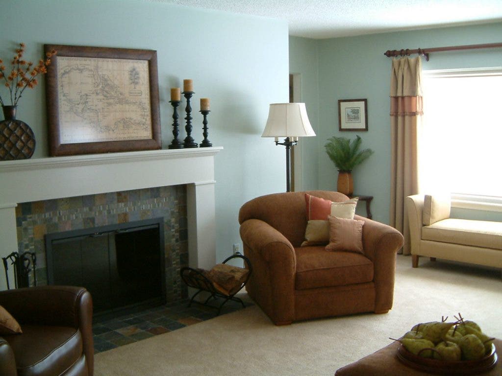
I am a big fan of creamy or white trim around windows. The reason is that the window trim is the first thing the daylight hits when it enters a room. The color of that trim is then diffused through the room. I once painted my bedroom trim blue, and it cast a blue light throughout the room, which I did not appreciate. The same is also true of dark trim around windows, it absorbs much of the light thus making the room seem darker. If you prefer a cozy, cave like space, then this is an advantage rather than a disadvantage. For those who prefer a space to be light and bright, then the white (or creamy) trim will do the trick.
Find out what's happening in Plymouthfor free with the latest updates from Patch.
For wall color, you really should get a sample and paint it on the walls. Several walls. The color will seem different on each wall, due to how the light will hit it. For some reason, yellow seems to multiply itself more than other colors. So for a yellow room, I always suggest to make it one shade lighter than you want, because by the time you paint all the walls, it intensifies the color significantly. If you plan on using a dark color , such as red, expect to paint multiple coats. Many paints claim to have one coat coverage, but the application process is imperfect, so I always expect to need two coats, and with dark colors, three.
For ceilings I often suggest a creamy white. I am not a fan of the old ceiling white colors that have a gray undertone, I find that it makes the ceiling look dirty. I prefer a creamy white that keeps the ceiling looking warmer. I also love adding color to a ceiling. Light blue ceilings can give the impression of sky, but you have to be careful about the color on the walls working with the ceiling color.
I know this has barely scratched the surface of paint selection. There are many nuances to coordinating colors, selecting the proper sheen, and much more. However, if anyone buys a sample of paint because they read this, then this blog is a success!