Neighbor News
It’s Time to Select Your Logo by Us- ‘Teaneck Doghouse’
The 'Teaneck Doghouse ', as the name doesn't implies, is the must to go location for the NJ residents to party & play

The ‘Teaneck Doghouse ‘, as the name doesn’t implies, is the must to go location for the NJ residents to party & play a pure kosher, family –friendly, sports -viewing ambiance. Families can have bunch of dating, recreational moves & endless gaming sessions at this awesome hangout place.
The venture find its existence when in 2014, a home watering hole was purchased by a local entrepreneur of NJ with the aspiration to build the ever first Teaneck, New Jersey's kosher sports bar.
Till then , the land lacked any pure kosher bar that could offer kosher food alongside alcohol & it’s becoming tough for the crazy sports , Jewish fans to dine out with their families or could spend a night out with buddies & watch something cool.
Find out what's happening in Teaneckfor free with the latest updates from Patch.
It’s because of this that made ‘The Teaneck Doghouse’ to enter! The Next Was the Logo for This Teaneck Brand. The brand is now flourishing by leaps & bounds. Meanwhile, we have come up with three logo sets “A”, “B” & “C” that we are sure would be loved by Teaneck Doghouse people & brand itself!
Designing a logo for a dine-in option is something critical & you must need to understand the ambiance & expected atmosphere by the eateries. With a pub's mascot-symbol in our mind & with an upscale & welcoming gesture for which a customer comes to you to spare his money, here comes the 3 Logo design by Logonado below:
Find out what's happening in Teaneckfor free with the latest updates from Patch.
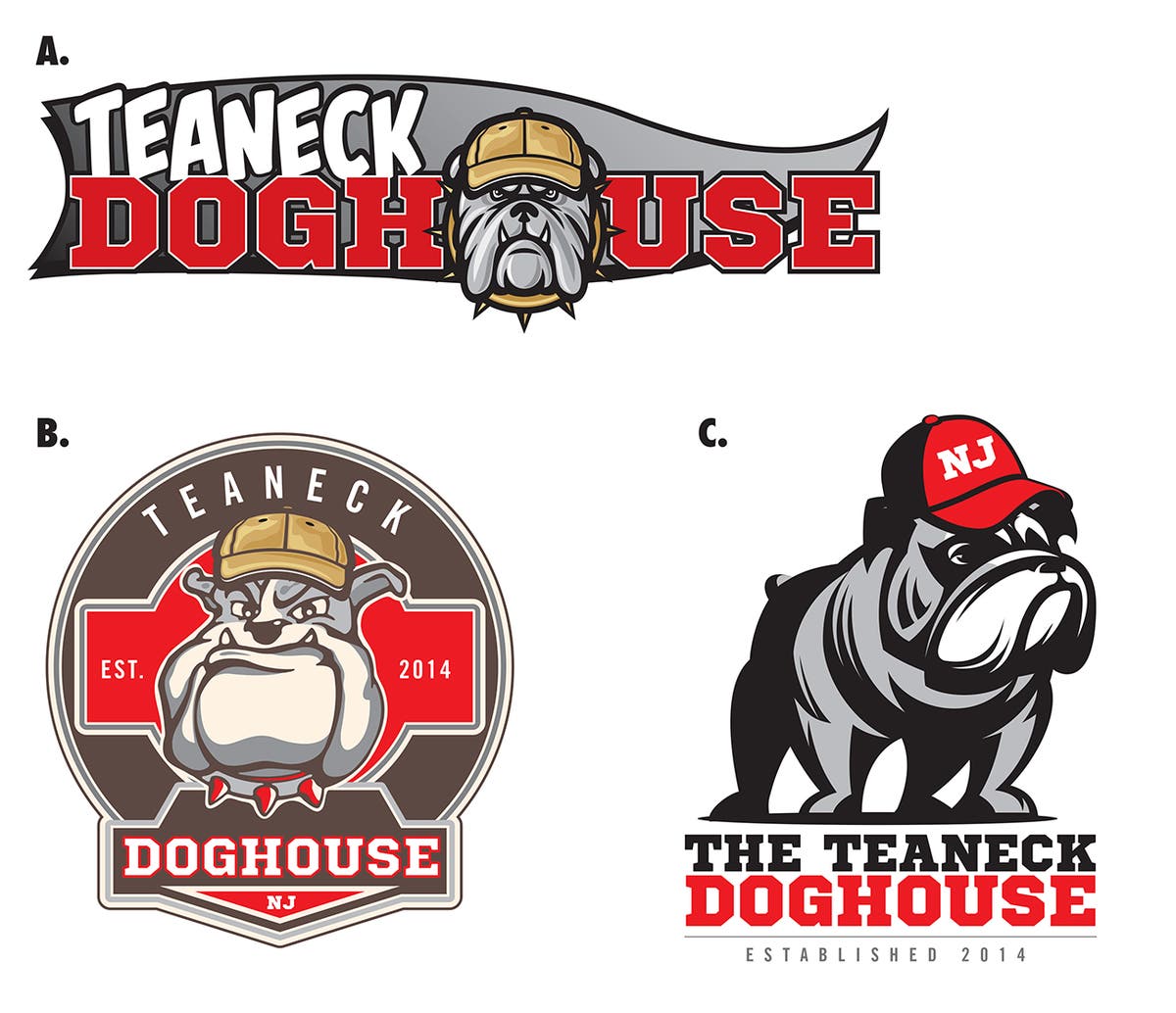
Logo A: Portraying the same "sporty" and "friendly" hotel image, we are confident enough that a more speak cartoonish version would go exactly for this flexible brand (not being in anyway dissimilar to the present logo).
A pennant motif is added as a recipe by us to almost suggest the logo like a team banner for the locals to enjoy, spare & food –drink! Fonts are kept as a mixture of comic-book and varsity to blur out the line between hospitable and athletic.
Logo B: This one is inspired from the banner hanging out on a pub‘s wall, eliciting a kind mixture of ’sports’, ‘recognized’ & ‘up-scale’ – a kind of tri-plaque.
The white bulldog is still pleasant, grumpy but smiling. The bold colors are entrenched in warmth and inspired by the Cleveland Browns, frankly. The fonts give out a modern mix of athlete chapters with slight "NJ" at the bottom to prop up the founding year.
Logo C: Finally, this icon is keyed around "upscale" and "established" with a cappy dog in red, it looks more handsome in this! Being a bit more decent and classy over others, the more realistic creature felt like a mascot that might be sitting outside your door with patience filled in & as a body guard for the kosher premises, waiting to cheer up its favorite team. Delicate athletic typography, warm colors yet again.
Which one would you like to go for Teaneck?